Case Study
Overview:
We recently worked with MageMojo, one of the biggest ecommerce hosting companies in the world specialized in Magento Hosting. Whereas their team’s strength lies in specialized technical capabilities of ecommerce, they struggled to define their digital presence and marketing outreach. With the help of the NeedGrowth team, MageMojo redefined their digital identity and grew their company over three times the size in just one year.
“NeedGrowth is the missing part of your team that you need to turn a good project into a great project. We first utilized them while creating our new website.
These guys are seriously talented. The end result was a website that not only looked great and contained the right amount of information, but most importantly converted visitors into customers. Together with their help we built a website our customers love and one that converts exceptionally well. Today we consult NeedGrowth on everything – from blog posts to printed materials to adwords advertising – because their expertise has become essential in everything we do.”
Eric Hileman, CEO of MageMojo
How Branding, Design & SEO Copy Can Affect the Bottomline
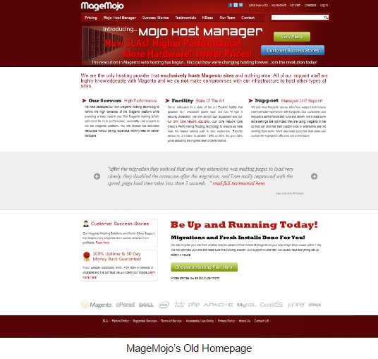
MageMojo is able to handle drastic traffic spikes and keep load times below 2 seconds, even when their customers run Super Bowl ads. How your page looks and how it is worded plays a large role when it comes to ranking on Google and conversion from visitor to customer. The MageMojo team had a problem with their brand, website design, confusing UX/UI, and poor SEO practices and conversion copy, all of which held them back and lost them customers.
>Find out how to improve your Digital Strategy<

Paired with their great service is a less than 1% attrition rate, meaning ecommerce stores who choose MageMojo never leave MageMojo. But their website sales funnel conversion was dismal: a very tiny fraction of their homepage visitors converted to customers, and NeedGrowth was tasked with a total revamping of their brand, SEO, UX and onsite sales funnel.
The Redesign
Similar UX and UI that highlighted the value proposition with marketing written copy, improved URL site architecture, and a simplified sales and checkout funnel. The result was a beautifully redesigned and rebranded website that changed the feel of the entire user experience accented with a royal purple and orange color tones that received rave reviews from new and existing customers alike.

The Results
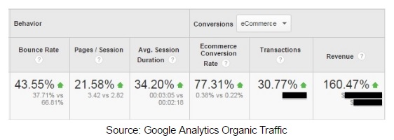
Within a few months, there were double digit decreases in the homepage bounce rate and in pages visited per session and average visitor time on site with huge jump in ecommerce conversion.

According to Eric, a year after the overall rebrand, SEO, and UX redesign, the MageMojo team grew three times and increased their overall sales accordingly.

