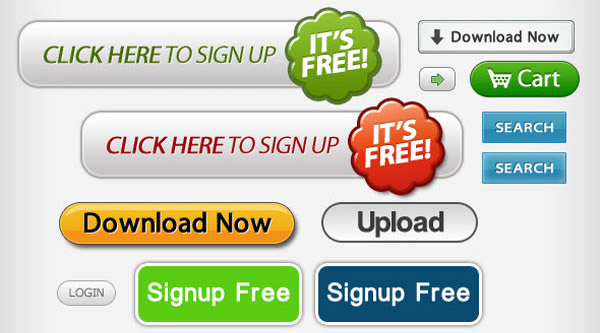
If you had to pack all your conversion wisdom and power into one tiny space, it would be the call to action button. It’s amazing how a single button can make or break an online business.
I’ve spent a lot of money and a lot of time making sure that my call to action buttons are as optimized as possible. I’ve co-founded two businesses and helped thousands of entrepreneurs, so I know how important conversions are, and how the call to action button plays into that success.
Along the way, I’ve learned a few things that can usher in floods of conversions, plus some things that can destroy conversions. In the paragraphs that follow, you’re going to discover exactly what I learned about creating call to action buttons that work.
1. Use a color that stands out
First, your call to action button should be a color, preferably not white, gray, or black. Beyond that, however, it should be a color that stands out.
The number of color combinations, gradients, shadows, fonts, kernings, borders, and other options is infinite. Make it easy on yourself with this quick color-choice checklist:
It needs to be a color.
It needs to stand out from the background.
It needs to not clash with the background.
It needs to grab your attention.
To find out if a color grabs your attention, simply create a variety of buttons and do the glance test. You can use http://buttonoptimizer.com/ to create the buttons. Lay them all out, and take a one-second look. Which one is most noticeable? Which one stands out the most? Which one do you look at first?
A lot of this decision-making will depend on your site’s color scheme, the existing design elements, and the background color.
2. Keep it simple
I’ve seen people do some real dumb things with buttons. They think, “Oh, so the button is supposed to stand out! Okay, I’ll put images, arrows, and CSS effects on it!”
This could be a mistake. Testing has proved that the best-performing buttons are those that have a simple statement and few design frills.
For example, ContentVerve.com tested two buttons. One had a cool eye-catching graphic. The other had a simple in-your-face message. The one without the image performed better. Simplicity, as it has been shown in test after test, trumps garishness.
Simplicity, of course, doesn’t mean boring. You can still fire it up with great colors, sizzling copy, and high octane design. Just don’t go crazy.
3. Size it sensibly.
Here’s the rule on size: Make your button a size that makes sense. Bigger is not always better.
The whole point of a button is to make people click on it. So, make it easy for them to do so. If you make it too big, however, it looks odd or unnatural, and may cause people not to click on it. The button needs to be big enough to click comfortably, but not so big that it looks weird.
4. Let them choose if you must, but only two choices
Most of the time, CTA buttons are going to be just that — a single button with a single message.
Sometimes, however, it’s strategic to use the choice approach. Psychology studies have proven that too many choices create paralysis. In the “paradox of choice,” people end up choosing none of the many options offered. If there are fewer options, however, then people are way more likely to choose one of them.
Another psychological tidbit is the “say yes” principle. If you can get someone to cognitively “say yes,” then they are more likely to convert. Landing pages often do this by presenting images or messages that a user will agree with. When it comes to the conversion action, the user is more likely to convert because he or she has been in agreement with the messaging.
If you’re going to give users a choice, only give them two. — the smart choice and the dumb choice. It’s intentionally a no-brainer. You’re not insulting their intelligence. You’re just subtly influencing their decision-making by making the choice really, really easy for them.
5. Make it look clickable
If the user is going to click on something, they need to know it’s clickable. Since we’re talking about “buttons,” I think this is pretty obvious, but let me just drive the point home with a few specific instructions.
Things that look like buttons are…
Rectangle shape.
Have clear boundaries or borders.
Have white space surrounding them.
Use a contrasting color.
Your button should look like a button to get more clicks.
6. Make the button the next obvious action
Buttons are part of the larger flow of a landing page or conversion funnel.
As a user moves mentally through the process, the button should be the final, and culminating, climax of the process. He or she should know — “Ah, now I’m supposed to click on the button!”
I discovered this when testing Crazy Egg call to actions. After testing, I realized that calls to action that were related to the product were the ones that had higher conversions. Originally, I was using a button that said “See plans and pricing.” Then, I tested a button that said “Show me my heatmap.”
“Show me my heatmap” had a 20% higher CTR. My takeaway was that calls to action that were the next obvious action of the conversion funnel were more likely to convert.
The next obvious action of Crazy Egg is that people want to see what I just described to them in glowing terms. They don’t want to look at “plans.” They want to see a heatmap!
Next logical action? Yes.
7. Keep your button copy short
Button copy is like the KO punch. It has to be a straight, hard, packed-with-power jab in just the right place. You’re not spilling words all over. Instead, you’re choosing just a few words very carefully.
The button copy should be readable at a simple glance. If it takes more than one second to read, then it’s too long.
Think about road signage. You know, in a split second that a stop sign says “Stop,” that a yield sign says “Yield,” and that an exit sign says “Exit.” Each sign has clues of color, size, shape, and placement that indicate its purpose and message.
Call to action button copy is the same way. You’ve prepped the user with messages, colors, codes, placement, and a suggested intent based on the flow of the page. Now, they need to simply glance at the button to just be pushed over the edge.
When they get to a button, people should no longer be in reading mode. They’re in clicking mode.
Glance. Click. Done.
I recommend that you make button copy no more 60 characters. If you get into 60+ characters, tons of words, and lots of brain effort, you’re losing your chance at a conversion.
Here’s a comparison.
This button below is borderline too long. There are 63 characters, including spaces. Plus, there are too many words. One of those words has five syllables! I find myself working too hard to read it, much less click it.
The next button from my personal site is way shorter. You’ve got twelve characters, three syllables, two words, and one overpowering message.
8. Make your copy sizzle
Button copy is not throwaway copy. It’s one of the most important few words on your page. I can’t tell you exactly what your copy should say, but I can tell you some of the techniques that improve conversions.
Use action words.
Verbs are the most important elements of a button copy. “Get” “Reserve,” “Own,” “Dominate,” “See,” “Give,” “Use,” “Try” — these are all words that suggest action and momentum.
Don’t ever use the word “submit” in your button copy. Testing shows that the word “submit” has low clickthrough rates. A study from HubSpot revealed that buttons with the word “submit” have a 14% conversion rate, compared with a 17% conversion rate for buttons that didn’t have the word “submit.”
Boring action words — “submit,” “download,” and “register” — can lower your conversion rate.
Use timing words.
It’s helpful to create a sense of urgency. The word “now” often helps to rush people into action. Another word is “today.” As long as people feel a bit urgent, you’ve accomplished your goal.
Here is one button that uses the word “Today.” Sadly, they use the color gray and a the dead word “register.” Oh well.
Keep it positive.
Occasionally, some have used the negative technique — telling people not to click. This technique should be used with care. Generally, people feel more optimistic when they see words like “Yes!”
Use a few obvious nouns.
Whoever your users are, there are a few words that they really like to hear. “Guide,” “Ebook,” “Course,” etc. Your button copy should explain what it is that they will see or get once they click.
Amazon’s buy button uses both a compelling action word — “proceed,” suggesting movement — and an obvious noun, “Checkout.” With its use of a contrasting color, this button possesses a powerful sense of progress and value.
Suggest value.
The word “free” is often used in button copy, and with good reason. It suggests to the user the value they will get when the click on the button.
Your value proposition was communicated earlier in the funnel. Now, with your button copy, you remind people of that value proposition through a few strategic words.
Conclusion
There’s no right color, size, image, or text that will improve conversions. You’ll notice, I gave you eight points of advice but not a formula for success.
That’s because there is no such formula. You need to choose elements that fit your niche and audience.
An article on Unbounce put it this way:
Buttons come in all sizes, shapes, and colors, and there really is no one-size-fits-all solution that works every time. People like to say stuff like “You should never use red because it’s a stop color” or “Green buttons are best!” While such generalizations are convenient, they rarely mirror reality. What actually works will vary wildly depending on context and the layout of the landing page.
Your results will vary, so you should test different versions to see which one converts best.
What tips do you have for optimizing your call to action buttons?

